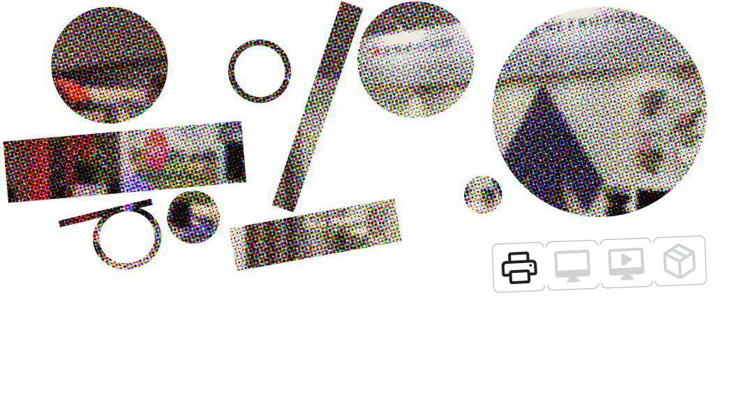
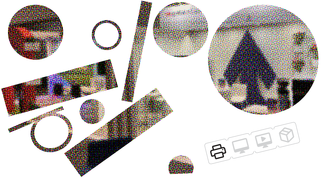
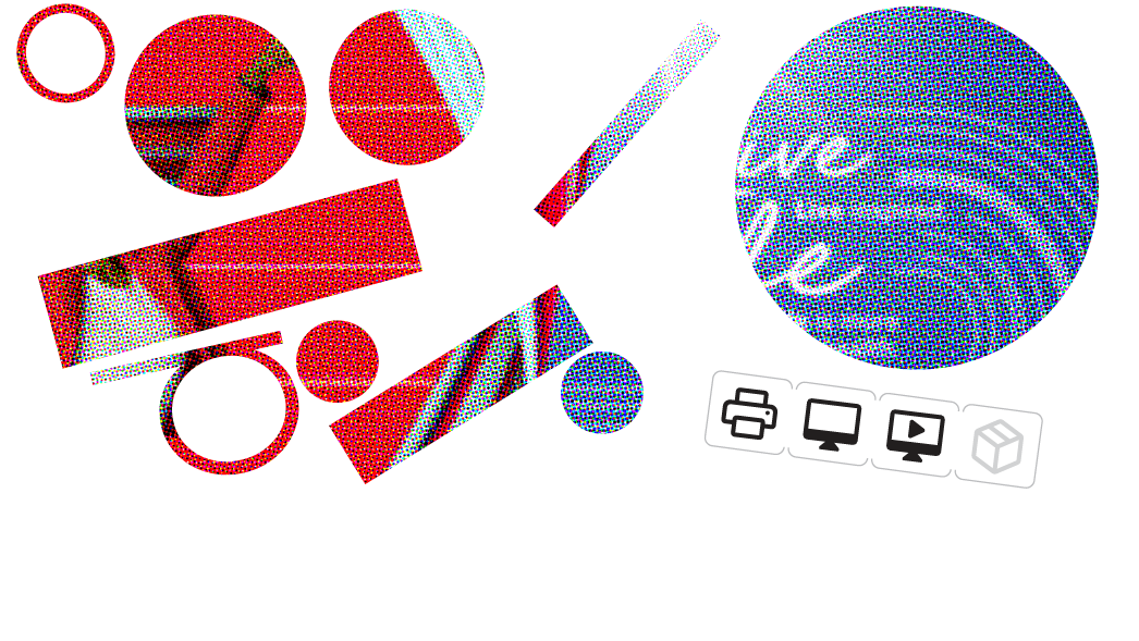
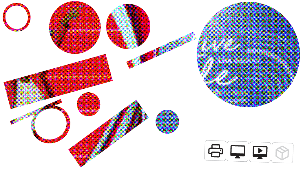
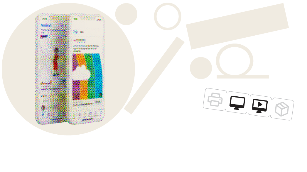
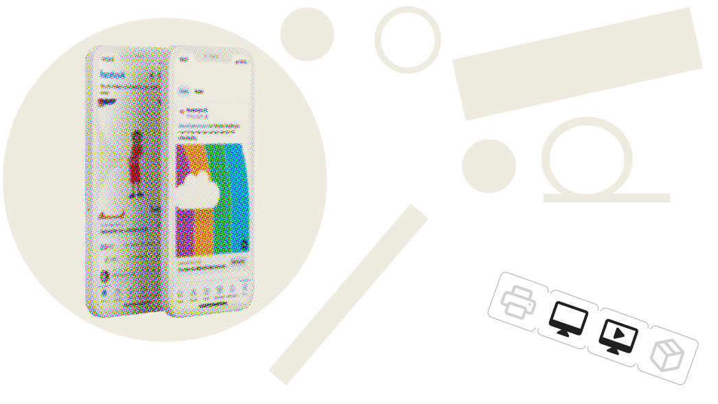
Every year we revise the Scheme's look and feel and update content with the latest rates. For 2023 I introduced a striped ribbon and patterns repeating the colours of our circular benefit diagram. It appears on the cover of our brochures, web banners, social media adverts, and even Microsoft Word templates.
I have decided to use the benefit structure colours more elaborately. It emphasises the flexibility of the options and contributes to a more unique identity separating the look from the rest of Momentum's offerings. It also makes the audience familiar with the way the Scheme is structured by introducing the colour coding a bit sooner.
Email banners used for general communications to members
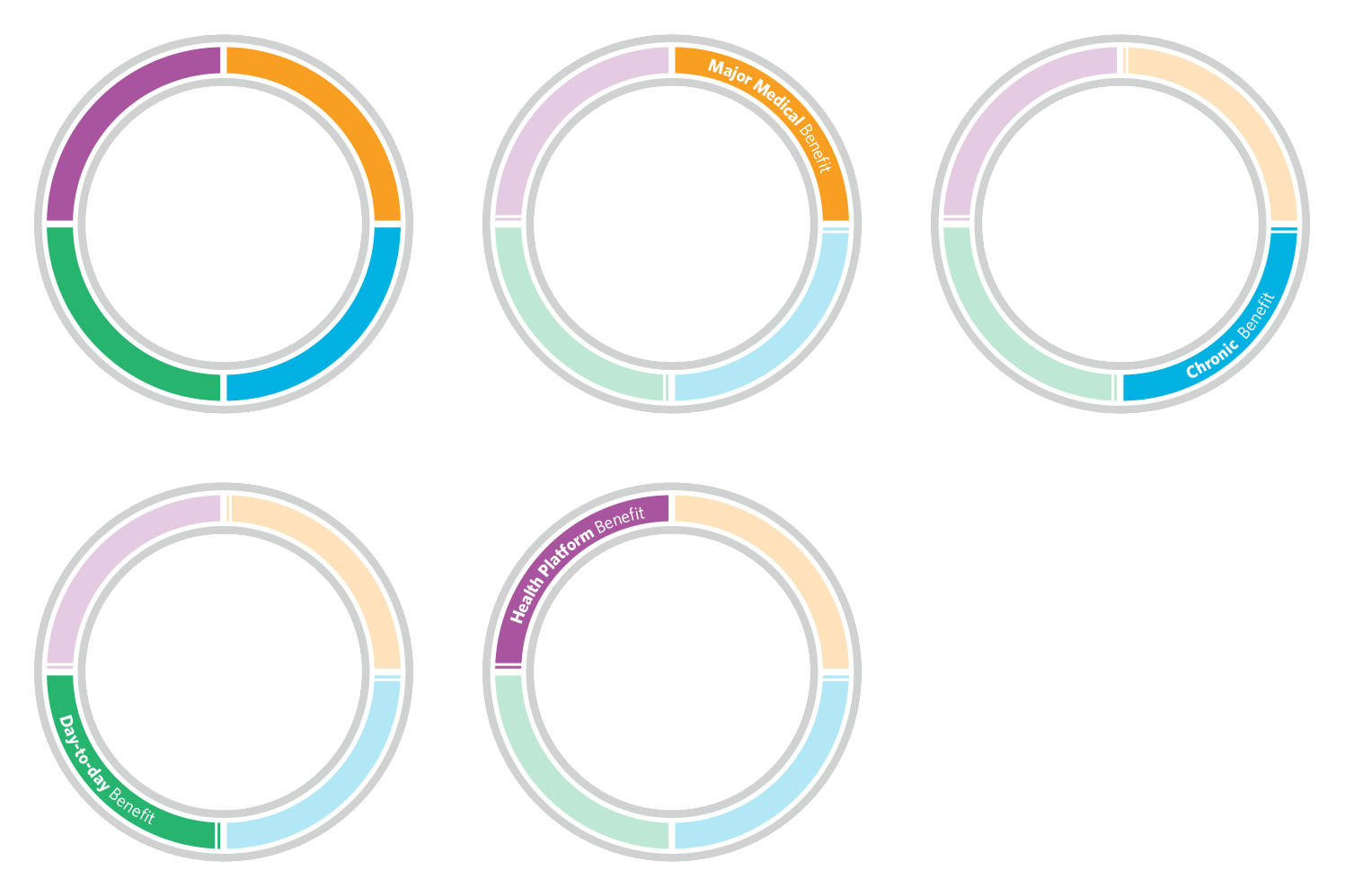
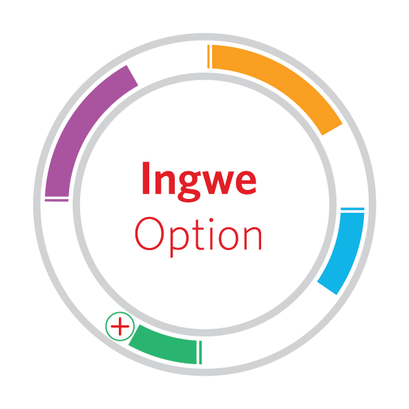
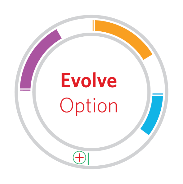
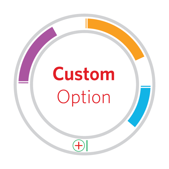
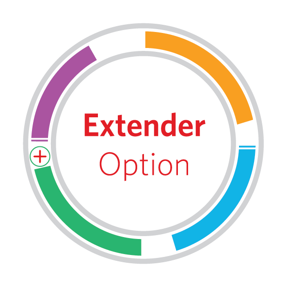
The benefit structure diagram below triggered the bold colours used throughout all the collateral.
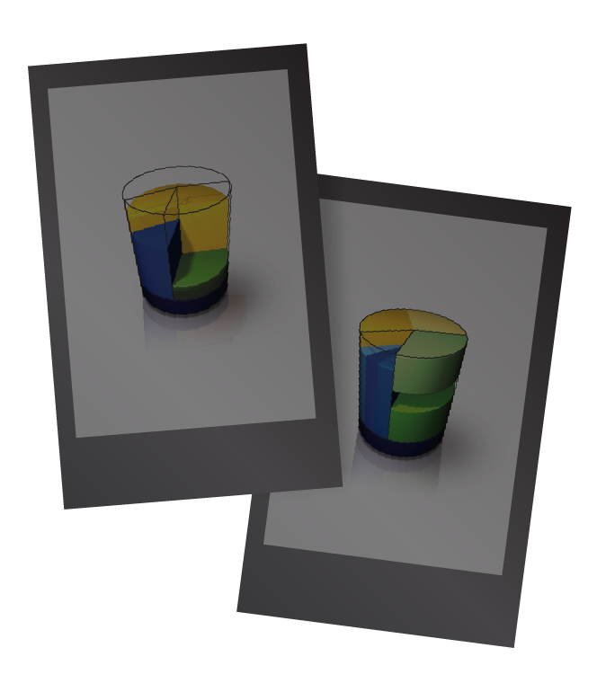
Momentum Medical Scheme has introduced a new circular diagram to explain its six plan options in a more user-friendly and visually engaging way. The previous 3D cylinder (visible here and greyed out) was complex and difficult to understand. The goal was to enhance clarity and improve scalability for digital applications. The benefits are now colour-coded across all related materials, making them easier to identify. The updated colour scheme gives a fresh impression compared to the more muted colours used before.
